How to Create a Killer Competition Slide (Hint: Don’t Use a Magic Quadrant!)
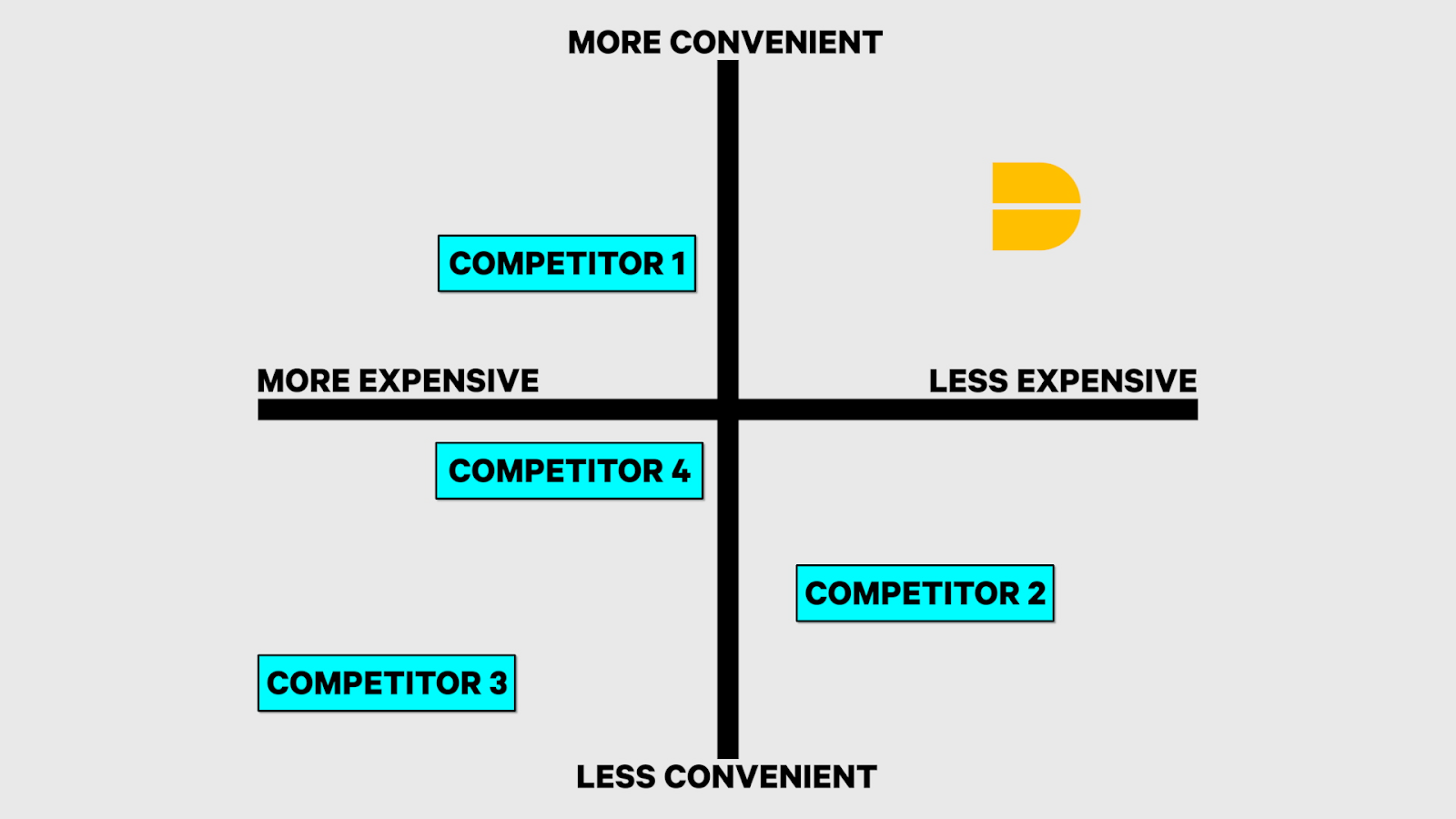
50% of the time, founders walk into a pitch meeting with Dreamit and show a competition slide that looks something like this:
That's called a "Magic Quadrant." If you present your competition slide as a Magic Quadrant, you'll do your company a major disservice. Why? Because when an investor sees a Magic Quadrant, they'll think:
Can your company actually only differentiate its product on two axes? Does your product beat the competition on just two key benefits or strategies?
If that's the case, and your product isn't much different from your competitors, why will people buy it or use it?
While Magic Quadrants work great for Gartner's research reports, they'll hurt your deck.
How to Create A Compelling Competition Slide
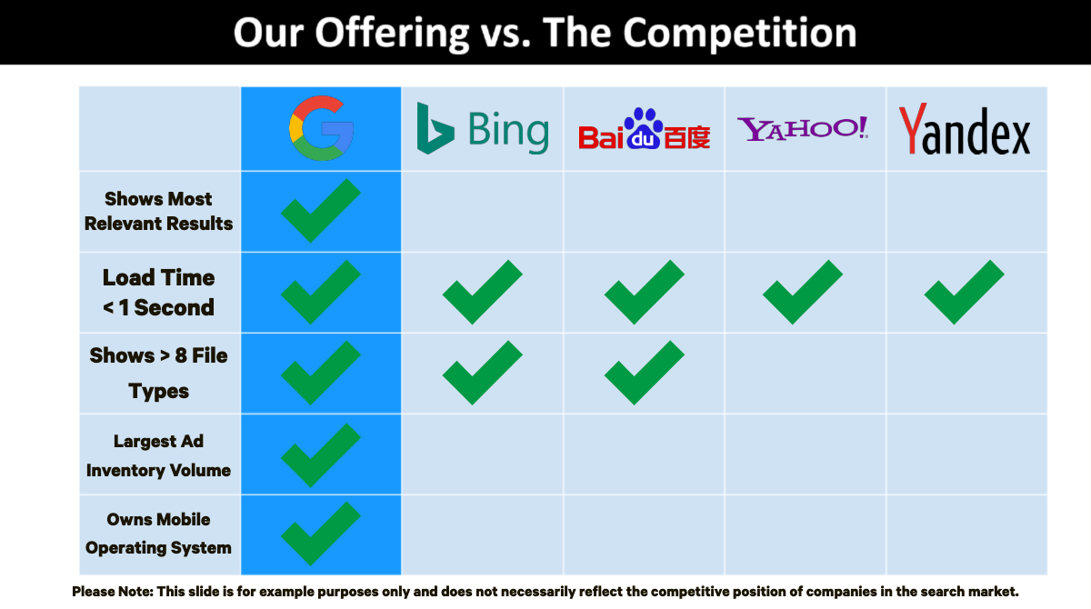
Instead of using a Magic Quadrant to show how your startup compares to the competition, you should use a Power Grid. Here's what a Power Grid looks like:
A Power Grid enables you to show how your startup beats out the competition in areas like its key benefits, go-to-market strategy, business model, and more.
Your startup should go on the left-most column of the Power Grid, so it frames every comparison to other companies in the table. After your company, put your three biggest or most well-known competitors in the next three columns — the 3 top companies you know an investor is always going to ask you about.
For example, if you wanted to pitch Google and show its competition in a slide, you'd put Google in the left-most column of the Power Grid and then add Bing, Baidu, Yahoo!, and Yandex as the next four competitors.
After adding your three most significant competitors, you can also include a few other less-known competitors in the right-most columns of your Power Grid. But this isn't a requirement.
Now that you've added the columns (your company and its competitors) to your Power Grid slide, you need to add content to the rows. In each row, you should include the key benefits (not features) that show the most compelling benefits that your target customers care about. Remember, benefits are the better outcomes or results people get when they use your product. Features are the parts of your product that enable its benefits.
In your Power Grid, you want to incorporate five to ten benefits where your company is better than its competitors. These benefits can be product benefits. Using the Google example from above, a product benefit could be "faster search"—Google returns search results 1.5X faster (not a real statistic) than any of its main competitors.
Other benefits you can consider adding to your Power Grid are business model benefits, strategic distribution benefits, go-to-market strategy benefits, or others. You don't have to list only product benefits when your company is superior to the competition in other areas too.
Again, going with Google as an example, your business model benefit could be you charge advertisers on a CPC (cost per click) or CPA (cost per acquisition) basis (creating better-aligned incentives between them and you) while your competitors charge them on a CPM (cost per thousand impressions) basis.
As much as possible, when you include benefits in your Power Grid, you want to quantify them. It's much more effective to say your product is 30% faster, 2X as powerful, has a 25% lower COGS than the competition vs. using qualitative descriptors like "much faster," "more powerful," or "lower cost."
You also should list the benefits in your Power Grid in priority order. To determine your most important benefits, consider your company's value proposition and what your customers care about the most. Naturally, your top benefits will stem from what matters most to your customers.
Finally, when crafting your competition slide, you want to make sure your differentiators are as clear as possible. To make that happen, you should put a checkmark or a number in your startup's column when it has a key benefit and leave your competitors' columns blank when they lack that key benefit. That way, you'll declutter the slide and make it more digestible in less time.
In the end, your completed Power Grid competition slide should look something like this:
This article covered a lot of ground. To recap, when you add a competition slide to your deck, you should format it as a Power Grid. And, your Power Grid should contain the following key elements:
At least four columns where your company is the left-most column and your biggest competitors fill the next three columns in order of most well-known competitor to least. E.g., put right next to you the company you expect an investor to ask you about the most.
Five to ten rows—ordered by their importance to your customers—that contain the key benefits where your product beats out the competition. These can be product benefits, business model benefits, distribution advantages, go-to-market strategy advantages, or others.
In each row, don't use qualitative descriptors to differentiate your product from the competition. Instead, quantitatively describe how your product is better.
Format your Power Grid in a clear way. When your product has a benefit, add a number or check mark in the relevant cell. When your competitors lack a benefit, leave that cell blank.
Now you know how to create an effective competition slide. For other fundraising and pitch tips, check out the articles below:


